Let’s be honest. Handing a toddler a detailed medical diagram is a bad move. It won’t spark an early career in surgery. It will probably just end up as a soggy, colorful snack. Why? Because kids’ brains are like sponges that grow in specific stages. What delights a ten-year-old might totally baffle a two-year-old.
At Choppic, we believe illustration is a language. Consequently, you have to speak the right dialect for your audience. It is more than just drawing “cute” things. It is about understanding visual development. It is about knowing how much information a young brain can handle at once.
Matching the art to the reader’s age is a science and an art. Let’s break down how we adjust our brushstrokes for every stage of growing up.
Board Books: Big, Bold, and Beautifully Simple (Ages 0-3)
First, let’s talk about the tiny humans. Babies and toddlers are still figuring out how eyes actually work. Their vision is literally developing as they flip the pages. Therefore, high contrast is your best friend.
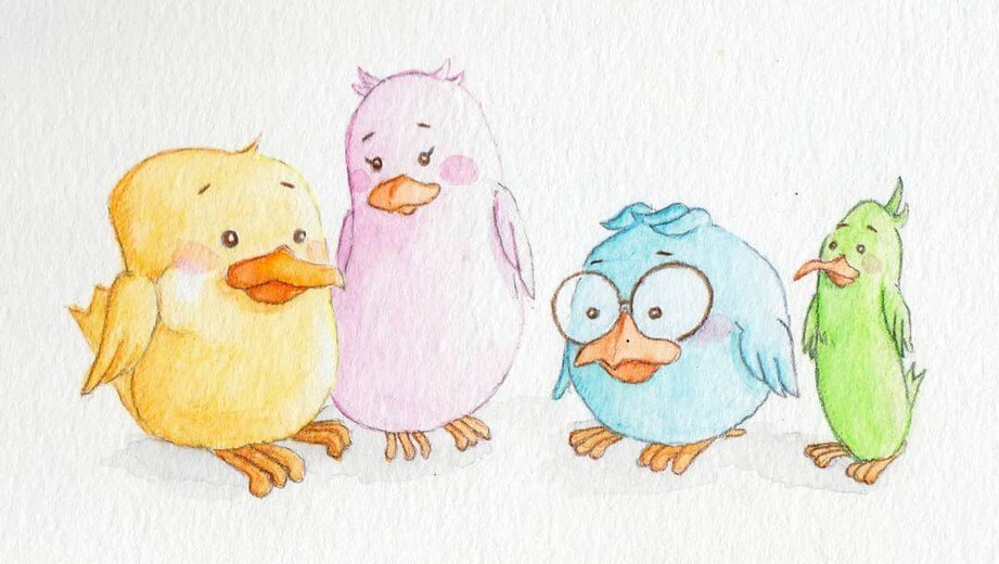
Think bold colors and thick, sturdy lines. Shapes should be clear and very simple. For instance, a “dog” shouldn’t have every individual hair rendered. A friendly silhouette and two big, expressive eyes work much better.
Furthermore, babies are obsessed with faces. They look for emotions they can recognize in the real world. They want to see “happy,” “surprised,” or “sleepy.” Basically, if it looks like a friendly face, they are in love.
Anyway, keep the background clean. Too much clutter makes it hard for them to focus. You want them to bond with the main character. You don’t want them getting lost in the detailed wallpaper pattern behind the cat. Also, let’s not forget the “chew factor.” These illustrations need to be readable even through a layer of toddler drool!
Early Picture Books: The Sweet Spot of Discovery (Ages 3-5)
Next, we hit the golden age of discovery. Children in this range are becoming visual detectives. They love to linger on a page. They want to find the secrets hidden in the corners.
This is where I start tucking in those “heuristic” details I love. I might hide a tiny ladybug under a leaf. Or perhaps a small toy peeking out from under a bed. These little surprises invite them to explore. It makes them active participants in the story.
However, the art still needs to guide the eye. We use composition to lead them to the most important part of the page. The characters can have more complex expressions now. We can explore nuanced feelings like “frustration” or “excitement.”
Actually, the connection between words and art must be ironclad here. The pictures should tell the whole story alone. A child should understand the plot even if the adult stops reading. If the text says “he felt brave,” the art should show the cape fluttering and the chin held high.
Advanced Picture Books: Bridging the Gap (Ages 5-8)
As kids start school, their attention spans get a serious upgrade. Suddenly, they can handle more complex layouts. We can use multiple panels on one page to show a sequence of events.
In addition, the themes can become a bit more daring. Maybe the monster is a little scarier. Or the forest feels a bit more mysterious. Consequently, the art style can become more textured and layered. I love using digital brushes that mimic real paint to add “weight” to the world.
Transitioning from simple pages to detailed spreads is a big step. It prepares them for the world of chapter books. Therefore, we ensure the art feels like a bridge to the next level of storytelling.
Middle Grade: Sophisticated and Story-Driven (Ages 8-12)
By this age, readers feel like “big kids.” They want art that respects their maturity. Interior illustrations here are often black and white, which feels more sophisticated.
The style can become much more atmospheric. For instance, I might use heavy cross-hatching or moody digital shading. These readers appreciate visual metaphors. They don’t need the art to mirror the text exactly. Instead, the art should add a new layer of mood.
Basically, it is about complementing the world they are already building in their heads. They want to be challenged. They certainly don’t want to be talked down to. A “cartoonish” style might turn them off. They prefer something that feels “cool,” “edgy,” or deeply artistic.
Why This Matters for Your Project
If you are an author, you might wonder why I obsess over this. Well, the wrong art style can actually push your audience away. An art style that is “too babyish” will offend a nine-year-old. Conversely, an art style that is “too busy” will overwhelm a three-year-old.
As an illustrator, my goal is to find that perfect balance. I want to make sure the visuals match your target reader’s developmental stage. This builds trust with parents and keeps kids engaged.
At the end of the day, I want every reader to feel seen. Whether it is a bright board book or a moody middle-grade novel, the art should feel like home. It is about meeting young readers exactly where they are on their journey. We want to spark joy and curiosity, not confusion. And maybe, just maybe, we can keep the books out of their mouths!